neue internet
Devlog №.8
So close I can taste it
The Happening came and went. Millions of dollars were spent on auctions, amazingly. Someone spent $50k+ on india/! @cymon shared more analytics in a thread on Twitter. I’m always pleasantly surprised when I mention Handshake in Ethereum spaces like Farcaster and people know what I’m talking about (it’s usually some variant of “Oh yeah, how’s that project going?” LOL). People spending tens of thousands of dollars on choice auctions on a four‑year‑old protocol is a good sign of staying power. Lots of lurkers with big bags and impressive names just biding their time, it seems.
If this is you, stay tuned for my talk at HandyCon; it’ll mostly be about beachfront/, of course, but you’ll be able to spin up your own…hopefully late this year.
Anyhoo, we sure got a lot done in February! The domain search process was gutted and revamped, and I settled upon a dope visual style. Likewise, the checkout flow went through a few iterations (and will likely go through more). Let’s dig in.
Search results

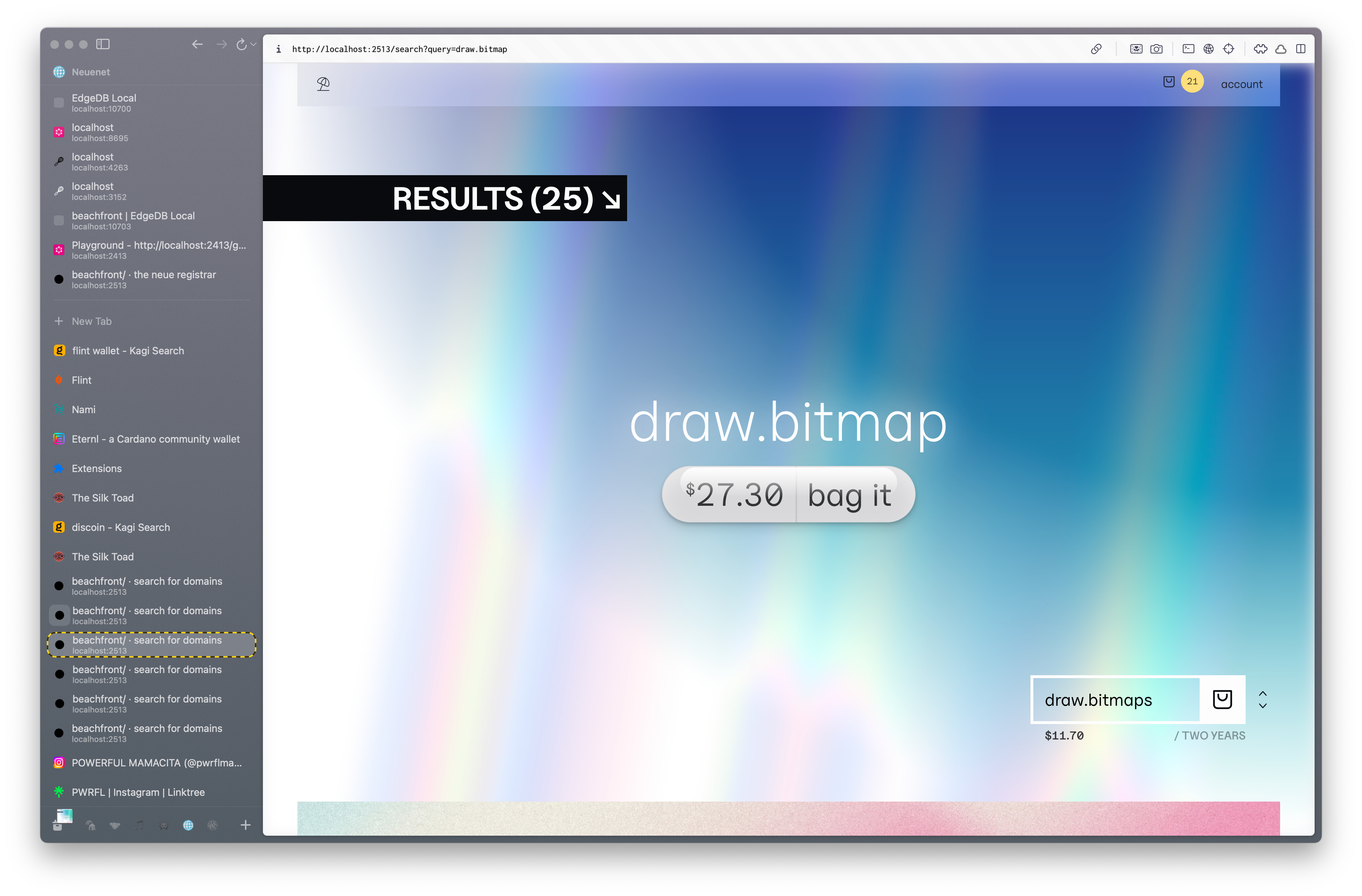
The initial version of the search results page was neat technically but unusable in practice. Aside from clearly being an unfinished design, the entire background was an animated gradient; this made scrolling a slog. You see that box in the bottom right? That’s a dropdown containing all the results. You could either click the dropdown to reveal a list or click the little arrows to navigate it. Neat! Took me two days to get right! Yuck!
I took a weekend off to attack the design with fresh eyes.
Problems with the old design? Way too much focus on the search term. An entire page? Unnecessary. Hiding search results behind a dropdown is a layer of friction. Meaning, I gotta do work to see the rest of the results? MEH. I ain’t doing all that.

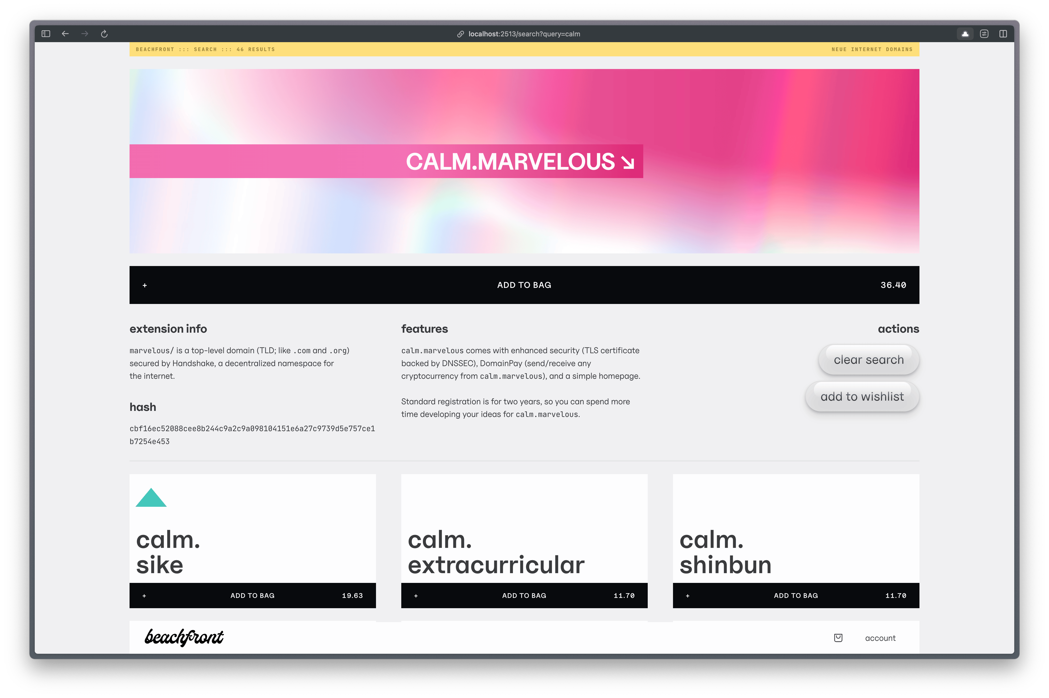
The new design is exciting. Pops of color, unique layout, useful information, and (hopefully) entices the prospective customer to scroll. I kept the animated background gradient, although I may disable it for Safari because scrolling this page was janky enough to be slightly annoying.
The colors and shapes on the domain results correspond to the Handshake name rating system created by Niami (which our pricing matrix also takes into account).
Checkout flow

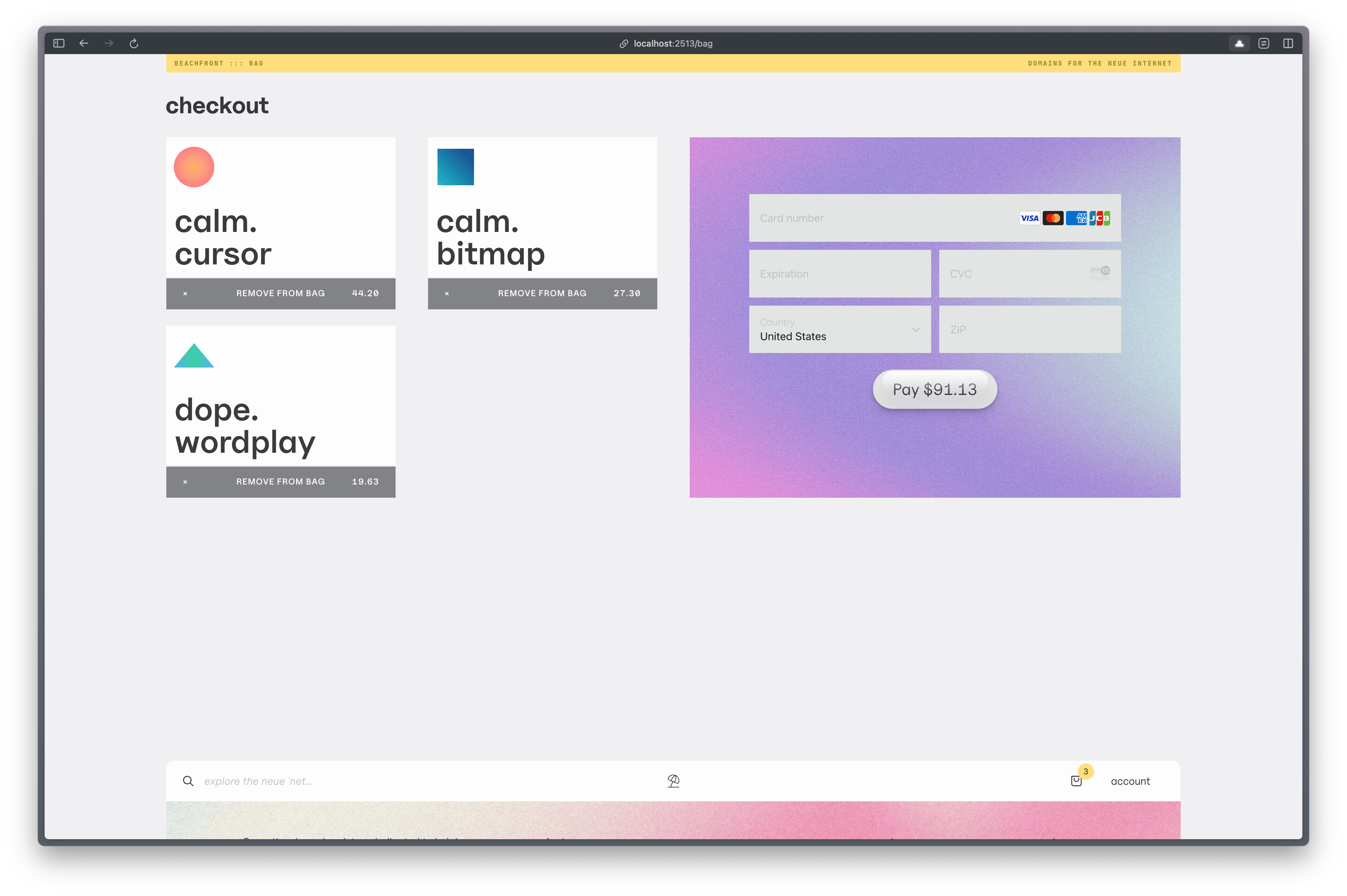
As simple as this looks, the checkout process is doing a lot behind the scenes. When an order is placed, we:
- check to make sure the domains in your bag are still available (someone could’ve been faster than you)
- charge you via Stripe
- create the domains with
PENDING_CREATEflag - create DNS records for domains (SOON)
- email you a receipt
- updates the UI with a thank you and links to your domains in your portfolio
- updates the domains with
OKflag (SOON)
What’s Next?
My process for building is:
- build just enough UI to see something
- build functionality into the API
- revamp the UI just enough to be presentable
- move onto the next thing
- repeat
There’s more features and polish I want to add to the search results and checkout flow but focusing on polish too early hurts development. I’m currently in the “unknown unknowns” part of this project, which is DNS. It’s a good thing I built Dolo, because I’m gonna need it! Actually, it looks like I may need to turn it into a module or microservice for the suthoritative nameserver I’m testing on (PowerDNS, much thanks to Rithvik for his setup tutorial).
When domains are created, I want customers to be able to create a link page or basic website immediately. Their site should be equipped with DNSSEC-backed TLS certs too. I’m trying to make fetch happen (bootstrap a more secure namespace).